Proof copies are on the way…
I finished the conversion of The Steerswoman to the larger paperback format, recreated the cover, and uploaded the whole shebang to KDP. I’ve reviewed the result online… but you just can’t trust how things look on the screen, as I found to my chagrin on other books. So, I’ve ordered some proof copies, to check how things look before I publish. They should arrive any day now.
And the cover really does worry me… it’s not just an issue of making it bigger. Since I’m going for a uniform appearance across all four volumes of the paperback, I thought it was worthwhile to try to fix some problems with the original cover. And for that, I needed to redo it almost from scratch.
Here’s why:
The cover used on the smaller paperback was based on the cover image for the ebook — and that cover was created in something of a rush. I wanted at that point (for various reasons) to get the ebook out as quickly as possible. For the sake of speed, I simply took the actual physical version of the map that was used in the book, and plopped down a real gold chain, an actual example of the “jewel,” and a mobius band ring on top of it. Then I lit everything as well as I could, and took a photograph. The camera was just a middling-quality digital camera, but amazingly, the resulting photo was not terrible. With the help of the GIMP image-editing software I trimmed it to the right size, added a title and author name and voila! Instant ebook cover. On sale in time for Christmas.
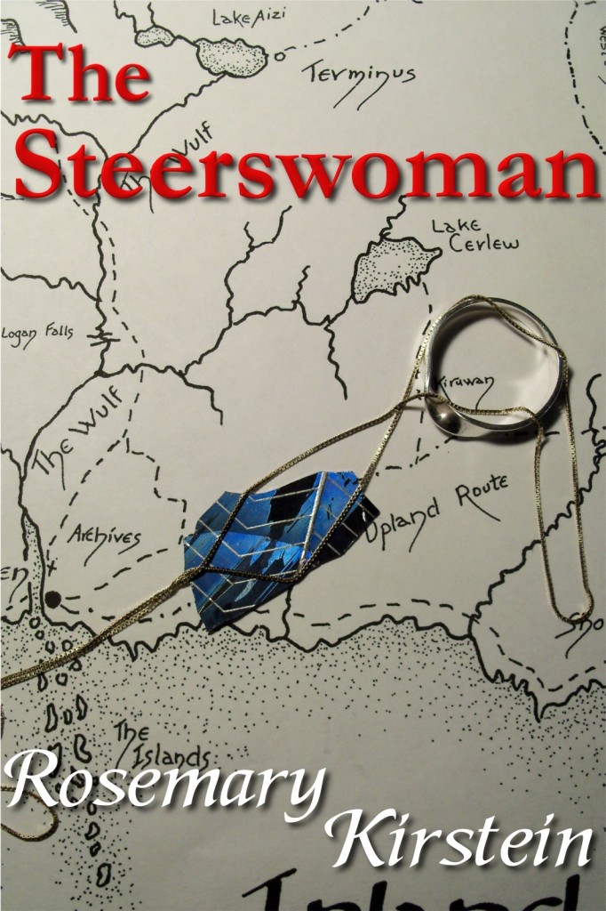
Ebook cover completed in a flash.
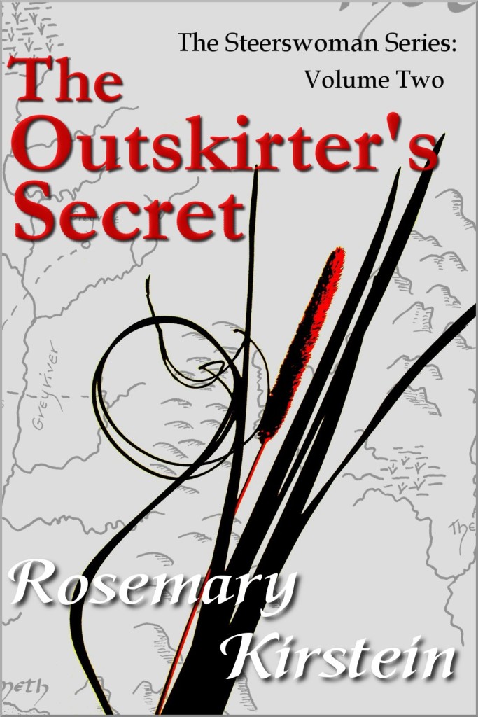
Once I had that design, I did the covers for the other three ebooks using the same concept: Map showing where the action takes place; object from the storyline placed on top of the map. I could not, however simply take another photograph for the other ebooks — mainly because things like redgrass and dragons do not exist in real life. So I did the whole thing digitally, starting from a professionally-scanned version of the master-chart, and creating adding the elements as needed.


And as you can see, there’s a big color difference between the first book and the other three. I discovered that it was impossible for me to reproduce the tone of the photographed map, and after much fuss, I finally settled on merely fading the map a bit, to keep it in the background so that it wouldn’t overpower the other cover elements. As ebook covers, they seemed to work okay…
When it came time to do the paperback of The Steerswoman, I went ahead and used the same photograph as the ebook as a base. I added a black bar behind the title for better contrast — for a physical book, the cover looked too busy, and too bare with the letters sitting directly on the map. And I removed the heavy shadows on the lettering. Those shadows seemed to work for a strictly digital image seen on a screen — but on a real book, the effect just came across as sort of hokey. It was much better without them. And once that was done, I did new covers with similar designs. I found that I didn’t need to fade the map into the background. I like the result:

But what you can’t see clearly in the photo above (taken with a mere iPhone, after all), is the very real color difference that still remained, between the first book and the others. It was still impossible to match the tone from the photo and reproduce the same color and tone onto the digital-image covers. Because it’s a photograph. I could not just select and block-change. The color and shading alter, literally from pixel to pixel, in subtle and unique ways. The best I could do for the other books was to get something close to the color of the top edge of the image, and have the image shade progressively darker toward the bottom.
But now, with a new edition — well, here’s my chance. I figured I could recreate the cover of the first book digitally, and back-match the color to the covers of the other three.
Right? Problem: The ring, chain, and jewel are still a photograph.
I’m much more nimble with the GIMP software than I was when I first started using it. I was able to remove the background entirely, leaving the ring, chain, and jewel. It was insanely painstaking (pixel by pixel), but I got it done…

And then I used the digital version of the master-chart to create the a new background for the cover (with shading toward the bottom), and put the jewel there… add the bar, lettering, and back-cover blurbs, and —

Yeah, it looks okay on this screen. But as I discovered with The Lost Steersman something that looks good on a screen can be very different when printed on an physical object. When I have it in my hands, will the difference between the photographed element and the rest of the cover be noticeable? Will it just look horrible in person?
And on top of that, the other books were made through CreateSpace, and this one was executed using the Kindle Direct Publishing’s paperback production process. It’s possible that there are going to be slight differences between the quality of paper, the clarity of printing, even the feel of the book in one’s hand…
Yeah. Gotta have that proof copy.
Oh, and guess what?
I literally just now realized that I selected the wrong cover finish. I set it for matte instead of glossy. The other books are all glossy finish.
Damn. Too late to cancel the proof order! Pardon me while I go and reset that option to the correct one, and reorder a proof copy. And spring for two-day shipping. Worth the cost.
March 24th, 2019 at 8:49 am
Damn, that’s ridiculously finicky. Having done some for-fun photo-editing before I can only imagine the amount of painstaking care required for a normal person to do it for a professional/commercial purpose.